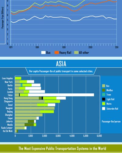
Infographic: Public transportation around the world
- Like
- Digg
- Del
- Tumblr
- VKontakte
- Buffer
- Love This
- Odnoklassniki
- Meneame
- Blogger
- Amazon
- Yahoo Mail
- Gmail
- AOL
- Newsvine
- HackerNews
- Evernote
- MySpace
- Mail.ru
- Viadeo
- Line
- Comments
- Yummly
- SMS
- Viber
- Telegram
- Subscribe
- Skype
- Facebook Messenger
- Kakao
- LiveJournal
- Yammer
- Edgar
- Fintel
- Mix
- Instapaper
- Copy Link
Posted: 10 June 2014 | Hoogleit Transport | No comments yet
This infographic from Hoogleit Transport contains several fascinating comparisons of public transport systems from around the world…


Public transportation systems differ greatly around the world. There can be huge disparities in terms of cost, efficiency, types and the numbers using it. Did you know that Oslo in Norway is the most expensive public transport system in the world? Or that passengers in Tokyo travel further by public transport than anywhere else?
This infographic from Hoogleit Transport contains several fascinating comparisons of public transport systems from around the world.
Simply click on the image below to view the full-size infographic.
Related modes
Light Rail, Metro


